As a commercial web developer, I’m constantly on the lookout for new trends in browser adoption and usage. After all, there are only so many hours in a day, and investing time and energy supporting a faltering standard is both frustrating and inefficient. So it was with some hesitation that I approached our latest project: A complete overhaul of the user interface for our commercial metrics analysis portal site, DMS Clarity Suite 10.
I knew from the last go-around that getting our site to render consistently across the leading browser platforms (legacy IE 6/7 and Firefox) was a chore, one involving lots of dynamic tweaks and clever hacks. Now we were planning to expand this list to include several newcomers, including IE 8 (running in “standards compliant” mode) and Google’s Chrome. The thought of testing, tweaking and re-testing each and every page against four or more separate rendering models was enough to make me start breaking out in hives.
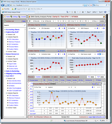
Worse, still, was the fact that, with our DMS Clarity 10 release, we weren’t just overhauling the UI. We were gutting the entire site to make way for a new, highly-visual, componentized interaction model. Gone were the static page layouts of the past. In their place, a collection of discrete rendering widgets that would assembled on the fly to create a fully customizable presentation. These widgets could be re-arranged, broken-out into their own windows and re-attached to other parts of the site in order to better identify and expose the most critical data points. Here’s a screenshot of the net result:
 Figure 1 – DMS Clarity 10 Portal Site (BETA)
Not surprisingly, the project ran behind schedule, with much of the delay attributable to us figuring out how to get identical results across our various target platforms. For example, calculating the window resize values for our slide-out widget configuration panel. Each browser had its own idea of how “big” or “small” a window would become when we executed the window.resizeto() method. To short, and you’d cut-off the panel. Too long and you’d end up with lots of ugly white space.
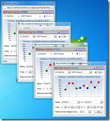
Our workaround was to read the browser make/version via JavaScript and then dynamically resize the underlying ASP.NET panel control prior to rendering the page - not a complicated task, but one that required a lot of trial and error to get the desired result. It definitely qualified as a “hack” solution in my book, though by all accounts its a fairly common one.
 Figure 2 – Clarity 10 Widget Rendering Consistently
Needless to say, we got to know a lot about the various quirks and rendering oddities associated with today’s web browsers. And by far the biggest PITA to work with – next to legacy IE 6/7 - was Firefox. HTML and CSS that would render consistently on IE 8 and Chrome would always require some hand-tuning for Firefox, while JavaScript code that ran flawlessly under the other browsers would often need at least some minor tweaking for Firefox to be happy.
In fact, it got so bad that we eventually had to expand our base template design to include three major potential rendering models: IE legacy, Firefox and “everybody else” (including Chrome and IE 8). And when even those assumptions proved to be inadequate (offset values that worked for one page would sometimes also work elsewhere, but not consistently), we seriously considered dumping Firefox support altogether.
With most of our commercial customers still using IE for in-house application access, it was a shortcut we could probably have gotten away with. However, in the end we decided to bit the bullet and hand-code the necessary markup and scripting corrections. After all, Firefox is still a major web presence, and we do plan to offer Clarity 10 as a hosted commercial solution later this year.
However, the situation was very much “touch-and-go” there for a while. Had we been under tighter time constraints, or if we had run into any real “showstopper” issues that compromised our design in some fundamental way, we likely would have given Firefox the boot.
Compounding matters is the perception, now shared by many of my contemporaries, that Firefox is in decline. Our own exo.repository numbers still show strong (50%) use among our tech-savvy contributor base. However, those same users are also increasingly turning to Google’s Chrome. Some 25% of systems monitored by the exo.performance.network report Google’s nascent web browser.
Figure 3 – Latest exo.repository Browser Share Statistics
If this number climbs much higher, and if Firefox use takes the kind of nose-dive so many are now predicting, we may have to revisit our decision to continue supporting Mozilla’s browser. With the web gravitating towards the rapidly maturing webkit, and with the latest versions of IE and Chrome converging towards a consistent rendering result, the writing may finally be on the wall:
Save yourself a headache or two and dump Firefox.
RCK


